Petco Love Brand Refresh
When I joined Petco Love, the brand’s creative identity lacked cohesion. Core elements existed, but years of shifting leadership and differing interpretations created inconsistency. My role was to bring clarity, consistency, and direction.
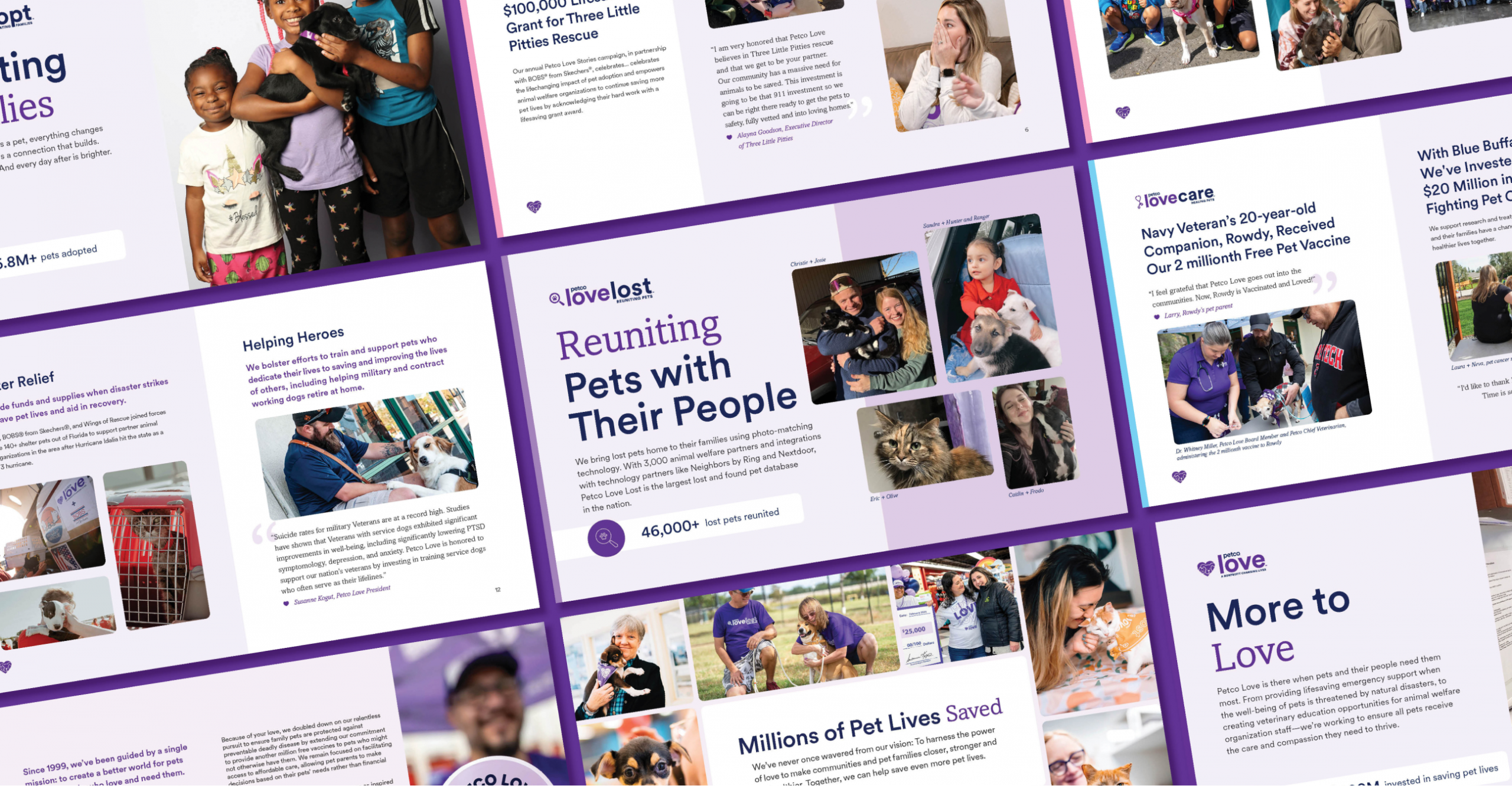
Drawing on my agency branding experience, I helped clarify and refine the Petco Love brand. I established clearer guidelines for color balance, typography, and branded type treatments, along with photography standards that defined what was and wasn’t on-brand.
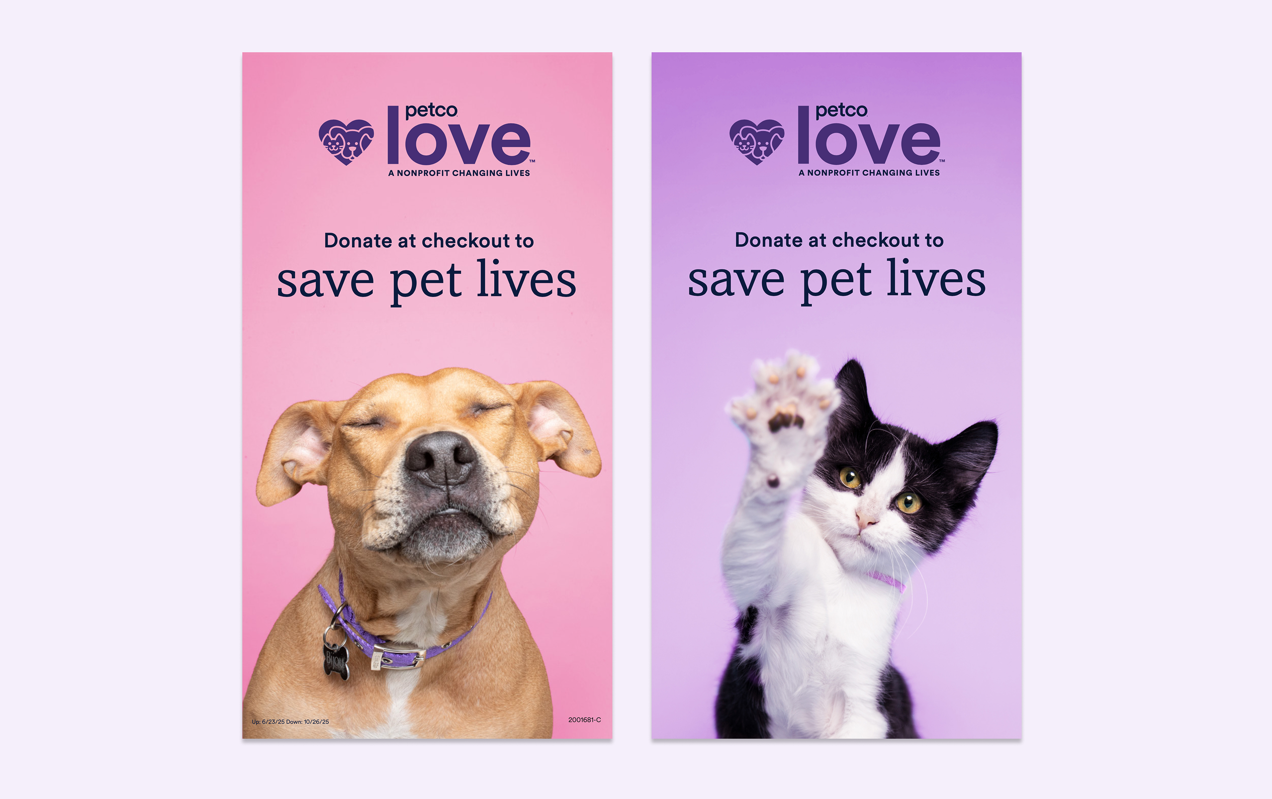
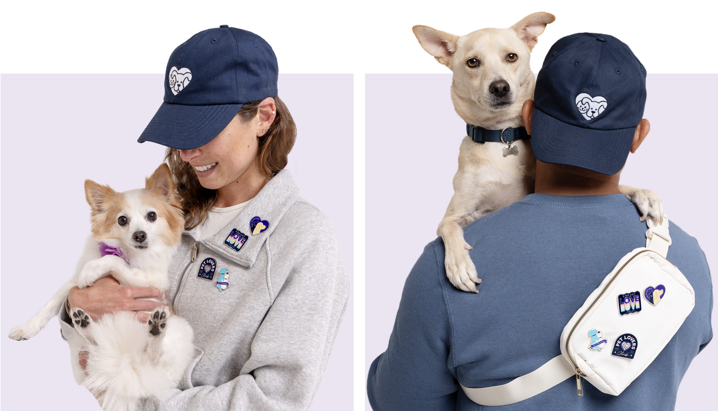
With Petco Love visible in Petco stores across the country, the brand system needed to complement Petco’s creative framework yet stay distinct, making it clear that register donations benefit a 501(c)(3) nonprofit.
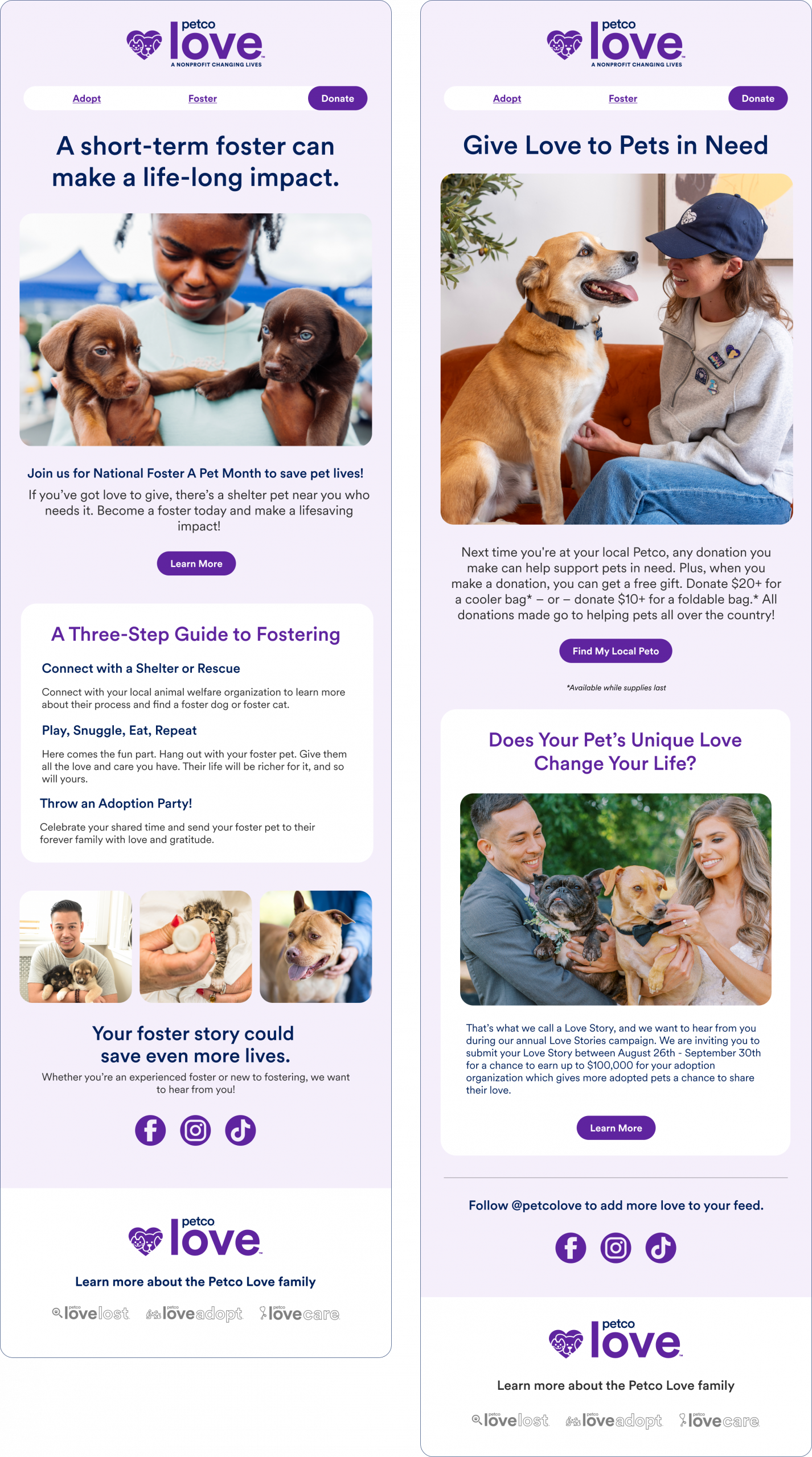
Once the creative building blocks were defined, we rebuilt key executions. My team refreshed email templates, aligning design with the website, and redesigning event and convention collateral to create a cohesive brand experience. This included defining visual language for multimedia storytelling in our video content as well.
Defining the Pillar Brands
The Petco Love visual identity also needed to account for its three pillar brands—Adopt, Care, and Lost—each focused on a distinct mission: adoptions, pet health, and lost-pet reunification.
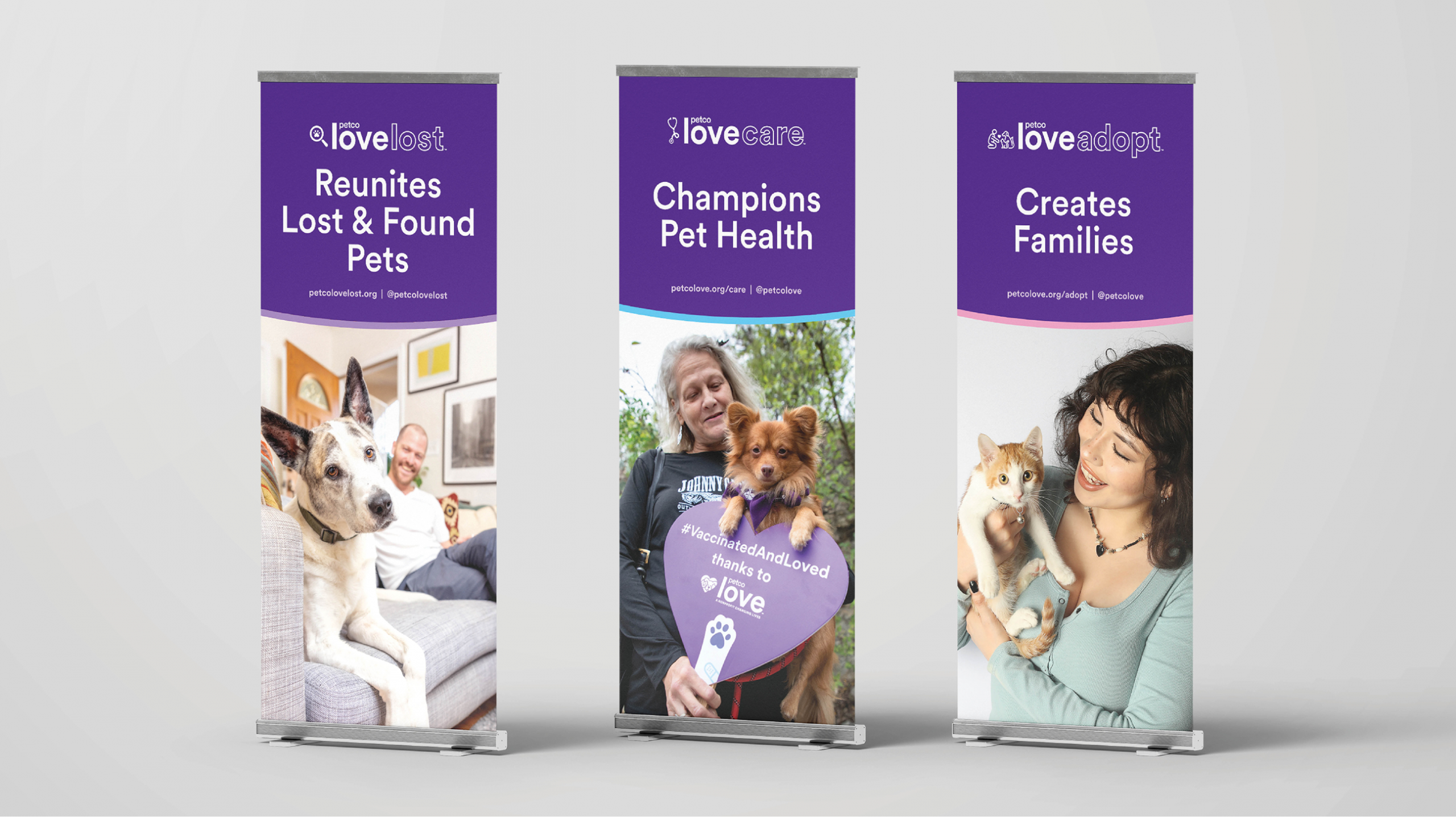
As part of the brand refresh, we explored how to differentiate these pillars through color, photography, and tone.
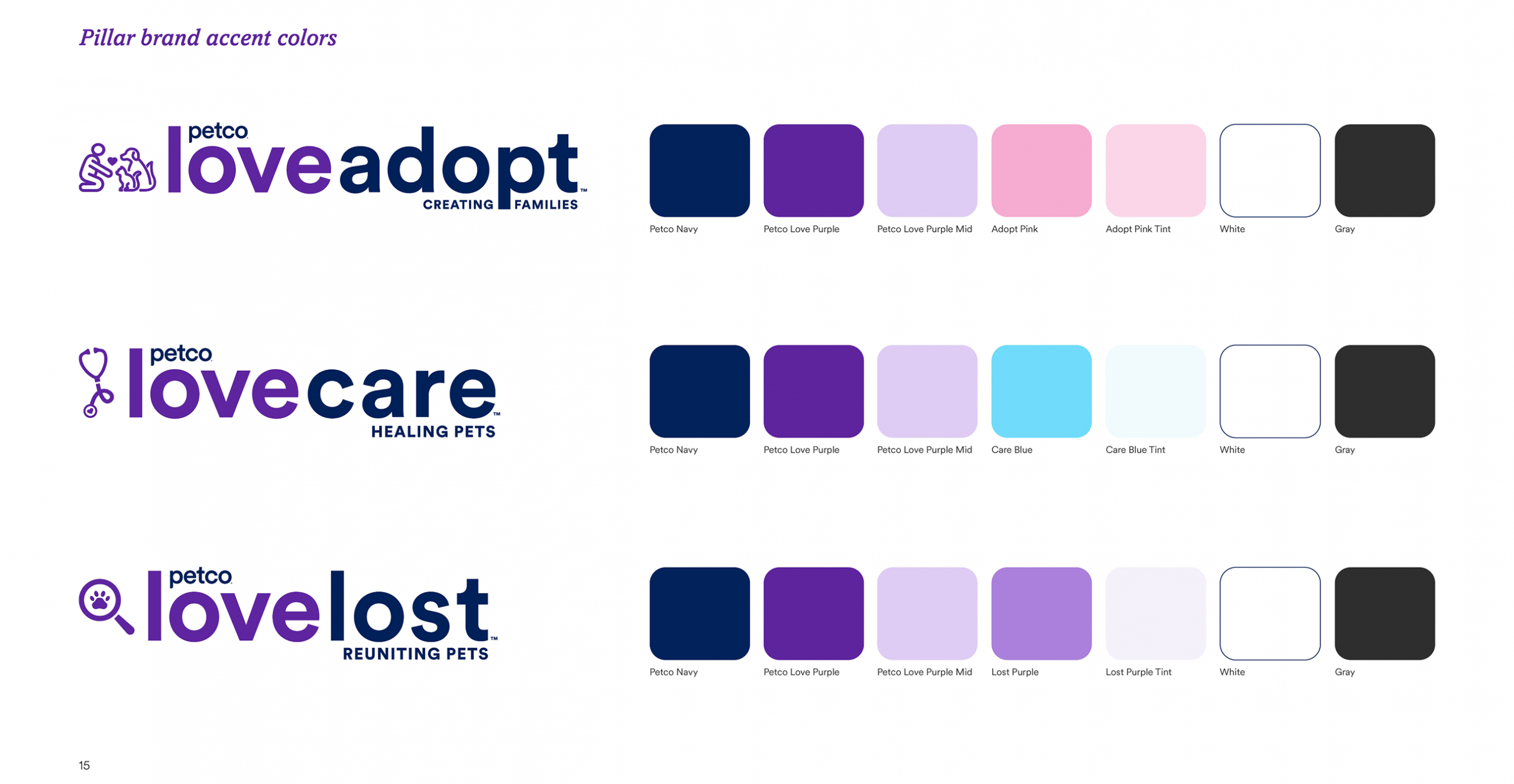
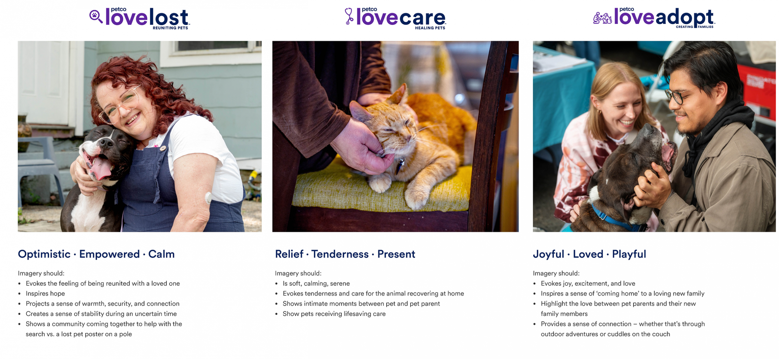
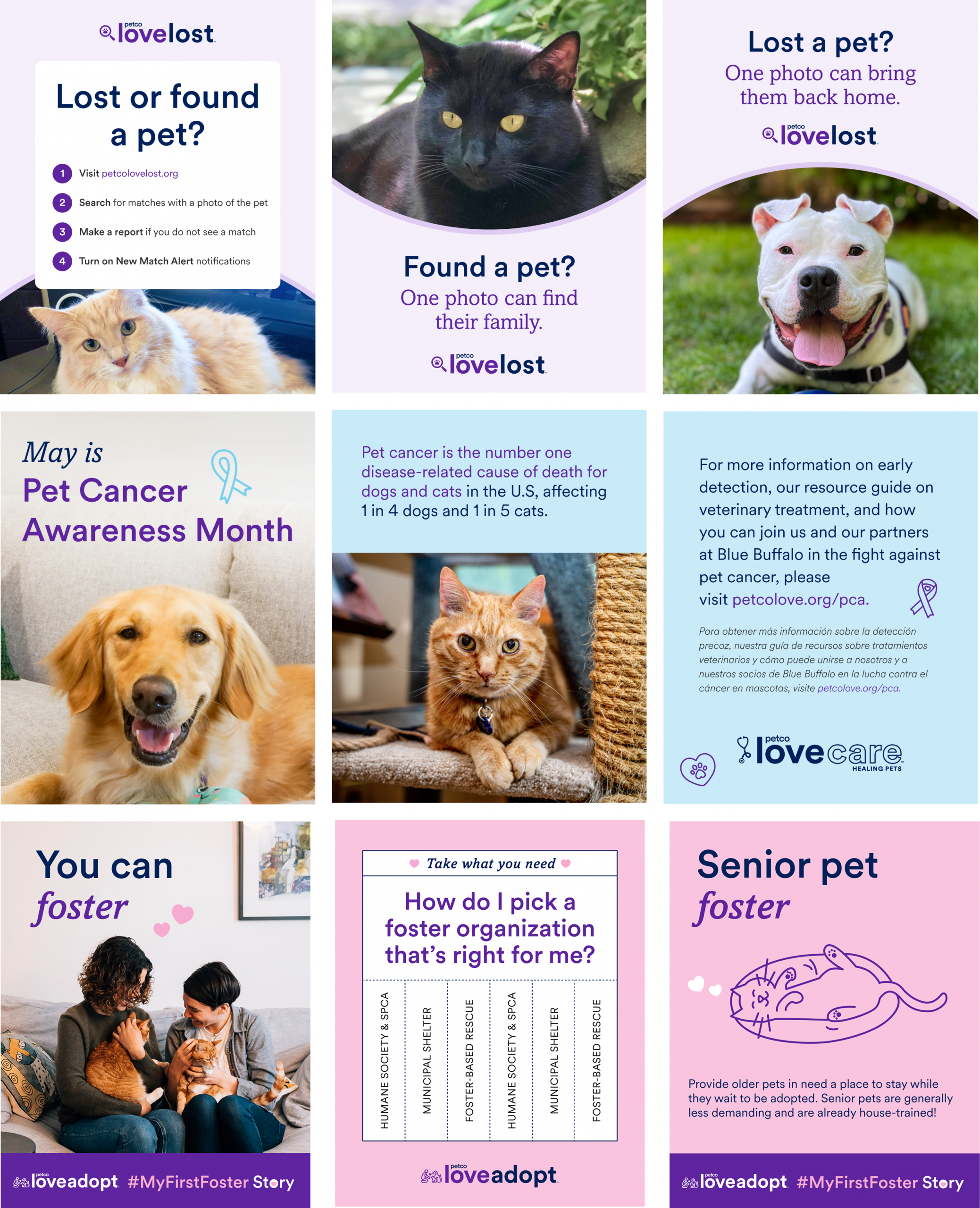
In the end, we built a holistic system that married all of the pillars to the parent brand and the wider Petco ecosystem, simply by defining how to use the existing brand elements. Now Petco Love has a stronger, more consistent visual language that can help build brand recognition.
You can see the entire updated brand guide here: 2025 Petco Love Brand Guide
